BENGALURU INDIA

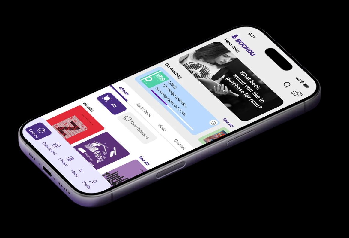
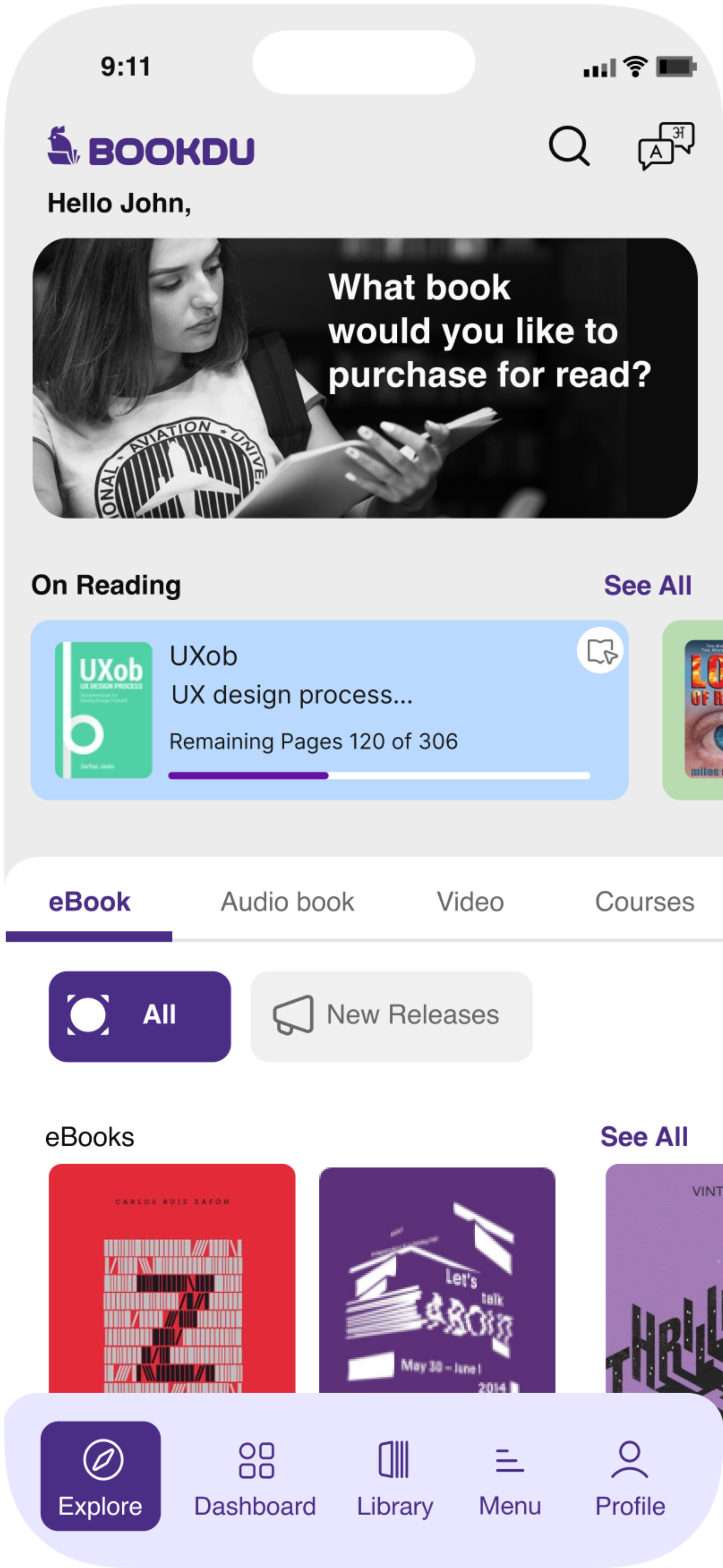
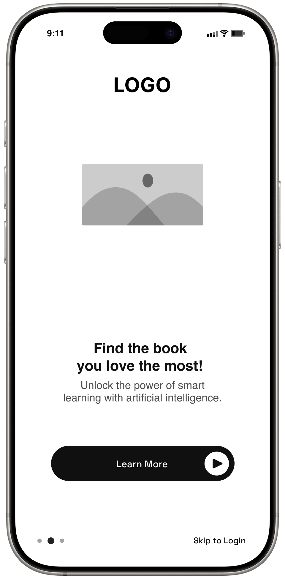
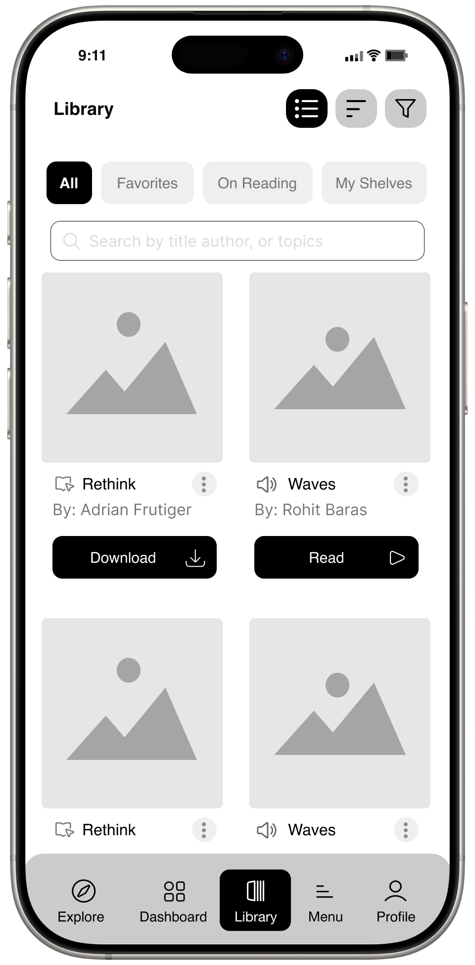
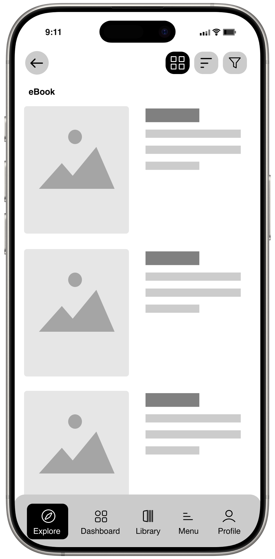
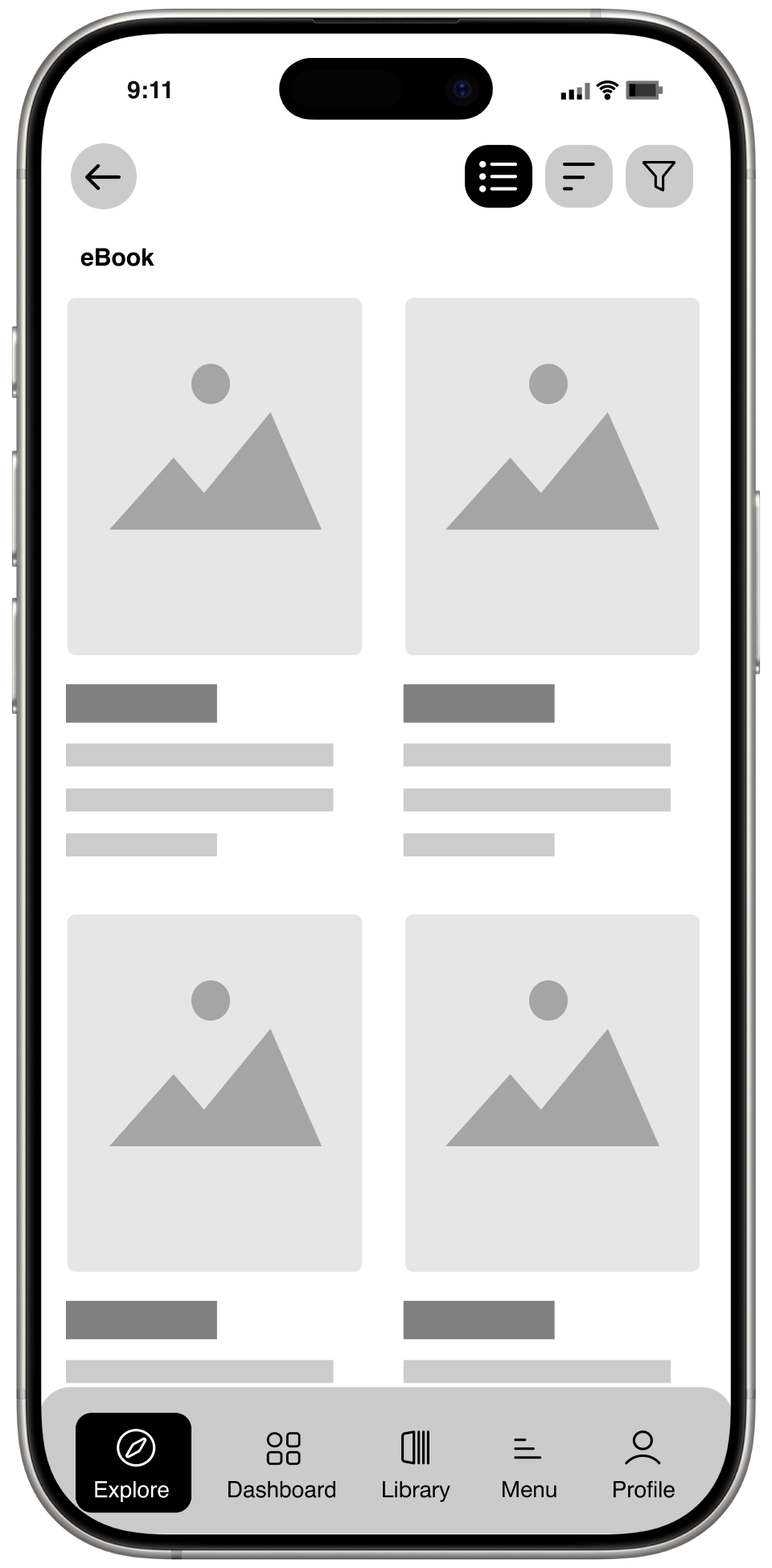
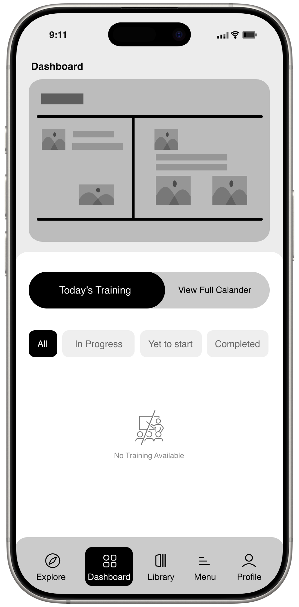
Bookdu is a Saas Platform, It helps users to learn digital content, published by authors. And track books which they've purchased and discover new books they want to read or allocated books to read for the users.

My Role
UX - Interaction Design, Visual Design, User Flows, Rapid Prototyping
Deliverables
Component Libraries
User Interviews
High Fidelity Designs
Team
Markerters
Product Managers
Developers (Web and Mobile)
Year
2024
Problem statement?
Finding the right book to read for professionals & Students can be a frustrating experience, Friends and colleagues have to look out for things to Using multiple apps for "Reading, Audio, and Video books".
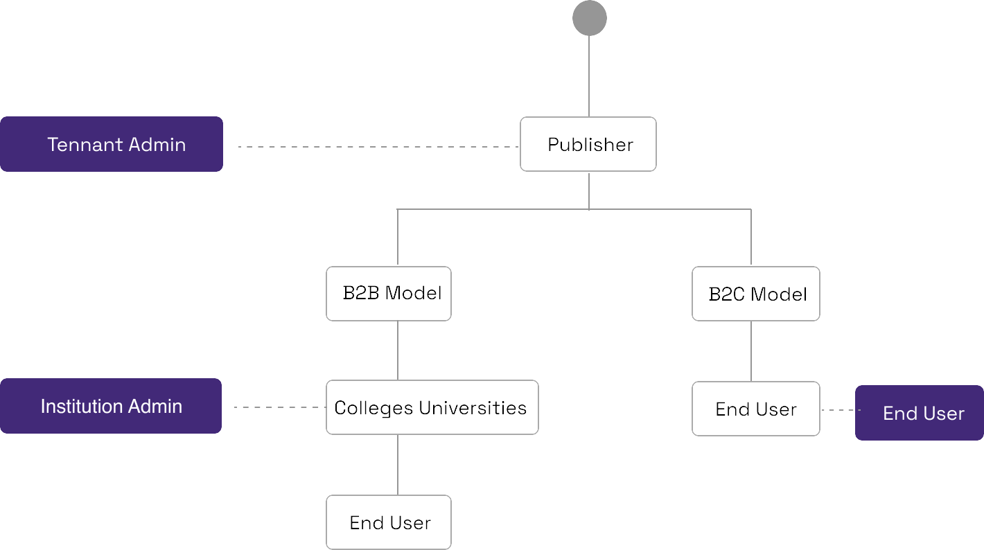
One platform for all B2B & B2C having a smooth journey experience.
Brief from stack holder
Till now they have a EUP (End-User-Portal) which is tracked by the tenant admin.
In order to reach more clients.
They want to build a mobile app.
Required a hybrid mobile app for EUA ( End-User-Application).
Come up with a user-centric approach to the app, adding features and flows that make it.
Busines goal
One App design for B2B and B2C.
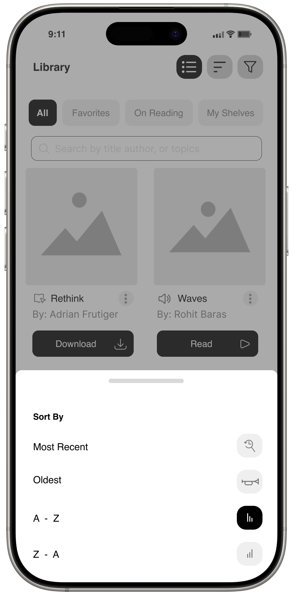
It's not only for books it should also support the Journals hierarchy.
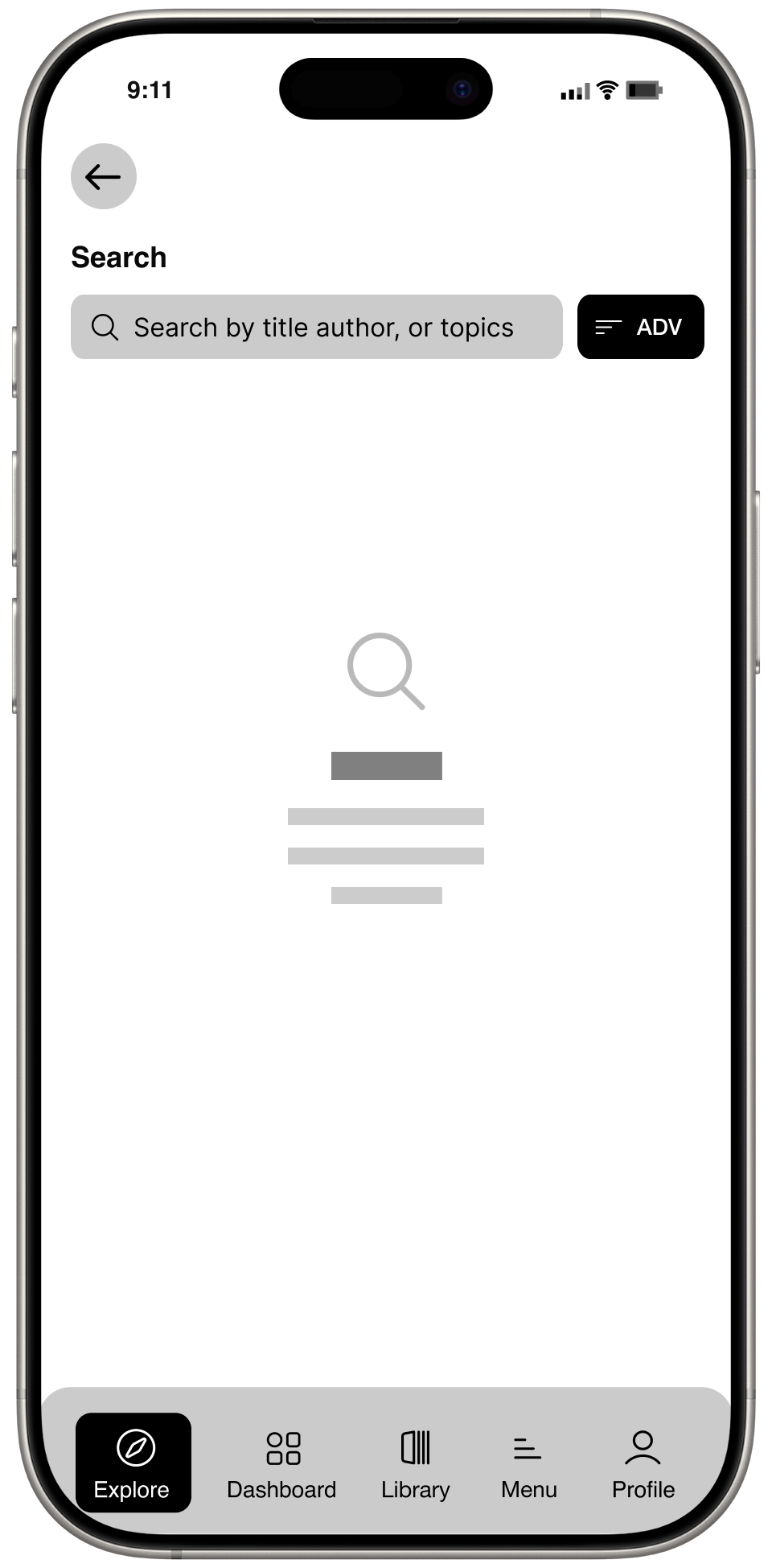
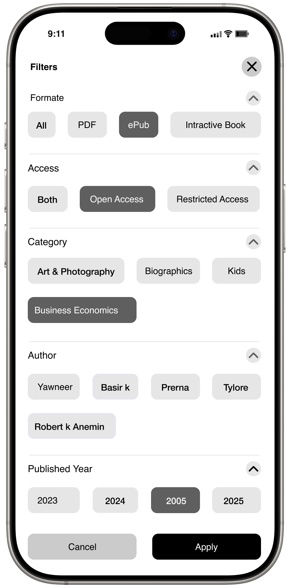
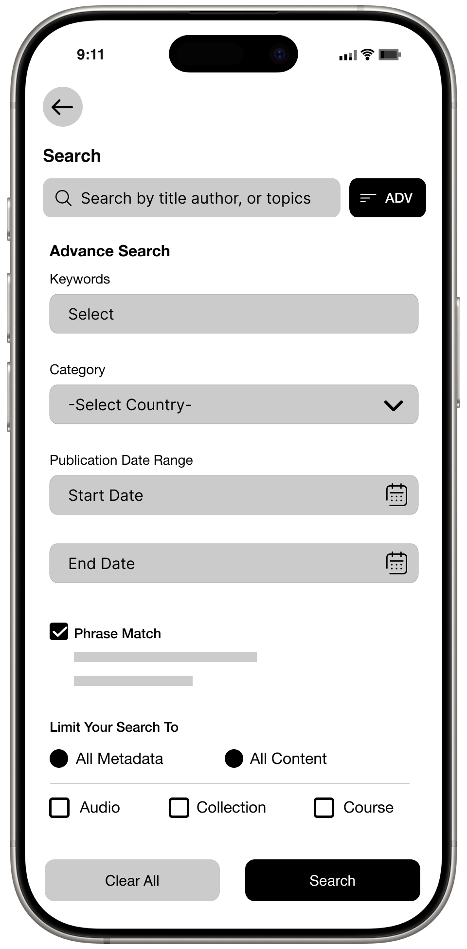
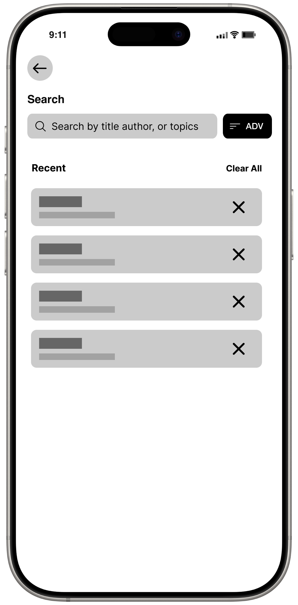
Search should support features like "Advance Search".
Types of Recommendations.
Solution
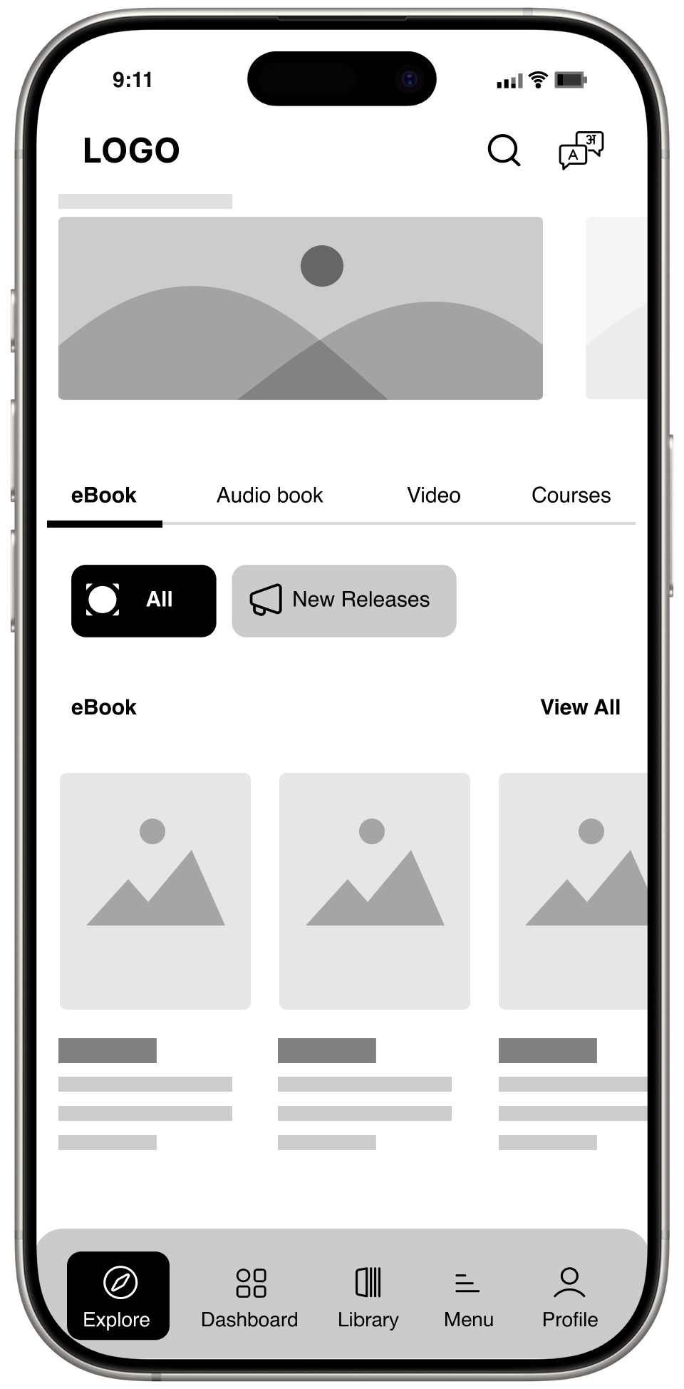
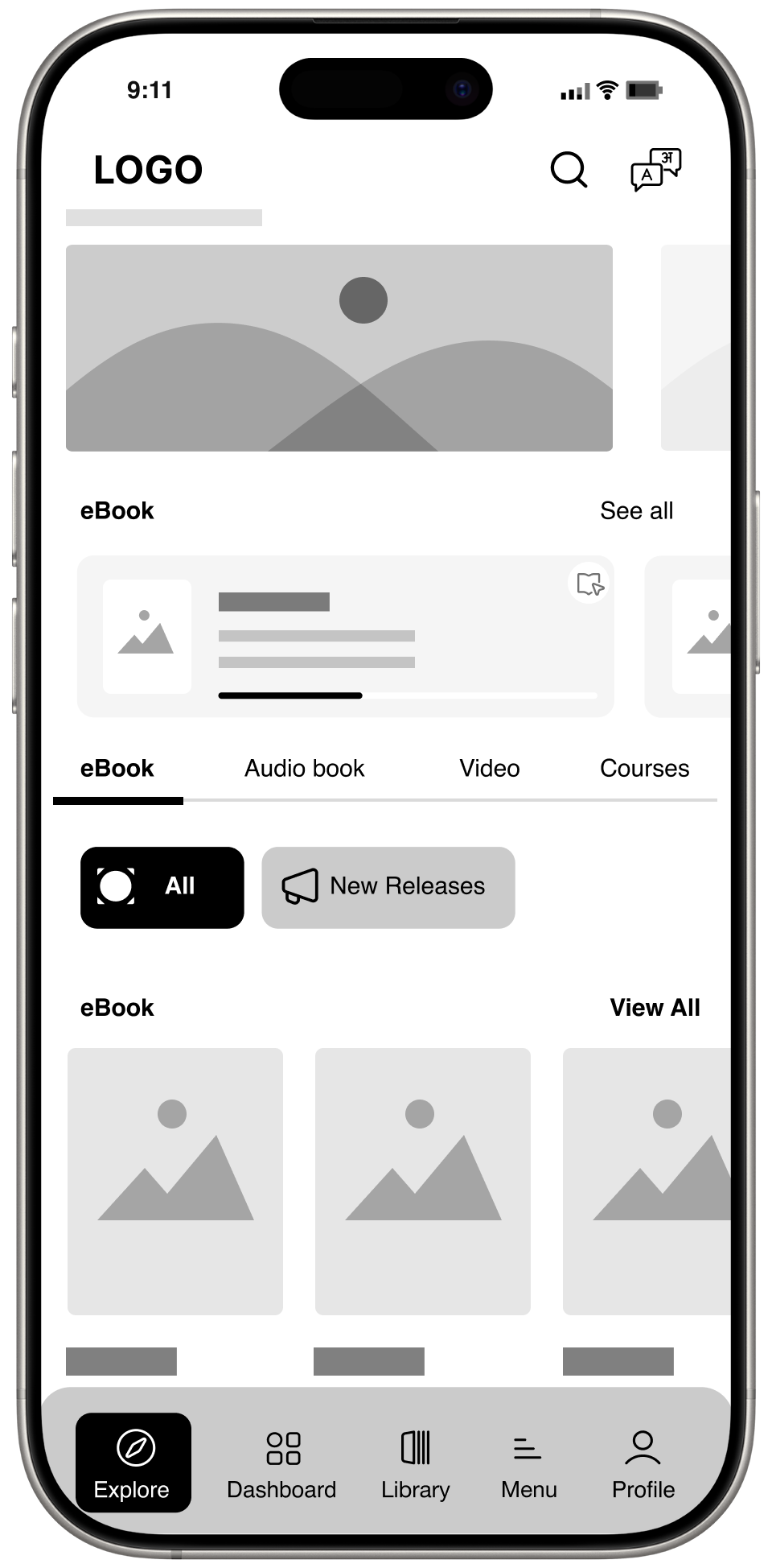
A digital platform where all types of user's can connect, and look for their interest type products like ebooks, Audio, Video.


Design Process

Impathise
User Interview
User Research
Competative Analysis

Define
Affinity Mapping
Personas
Empathy Map
Journey Map

Ideate
User Flow
Card Sorting
Information Architecture

Design
Low Fidility
High Fidility

Test
Usability Test
Implementing Feedback
Impathise
Understanding of Product
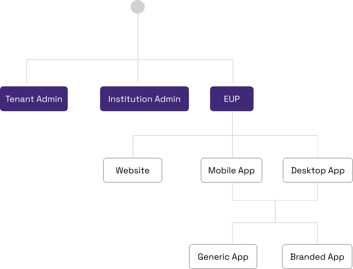
Understanding the list of users in product hierachy

Competitore Analysis

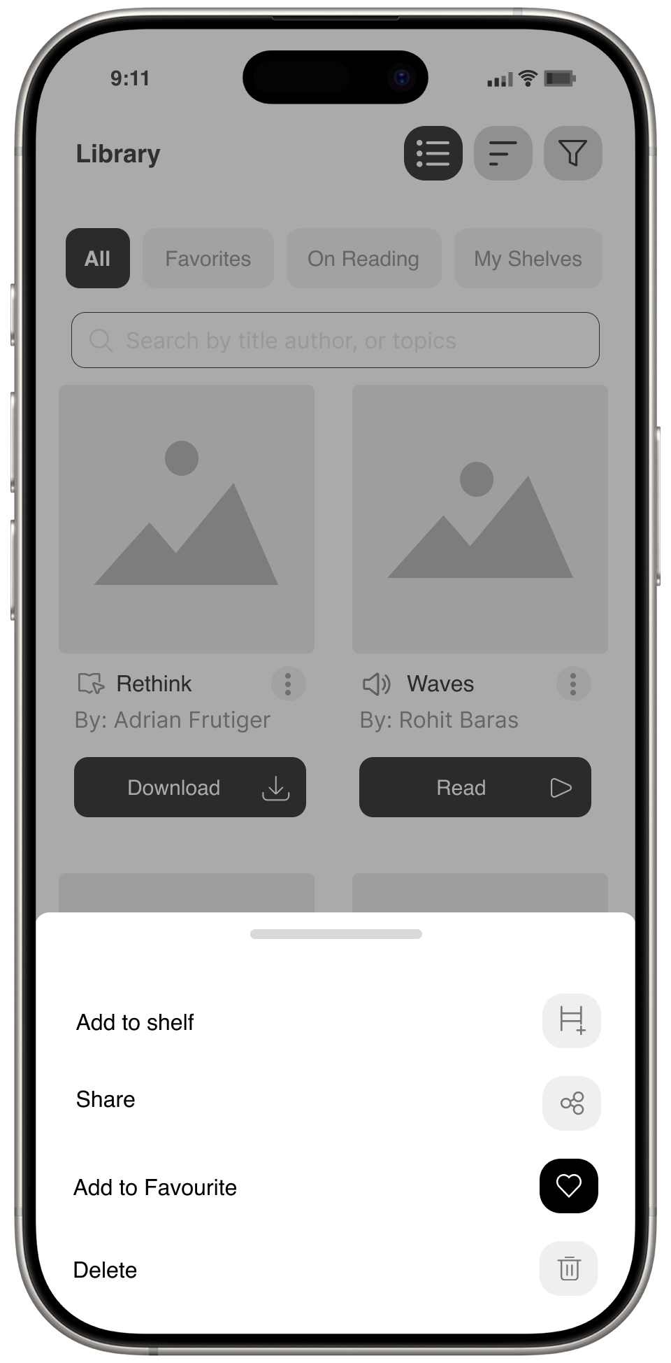
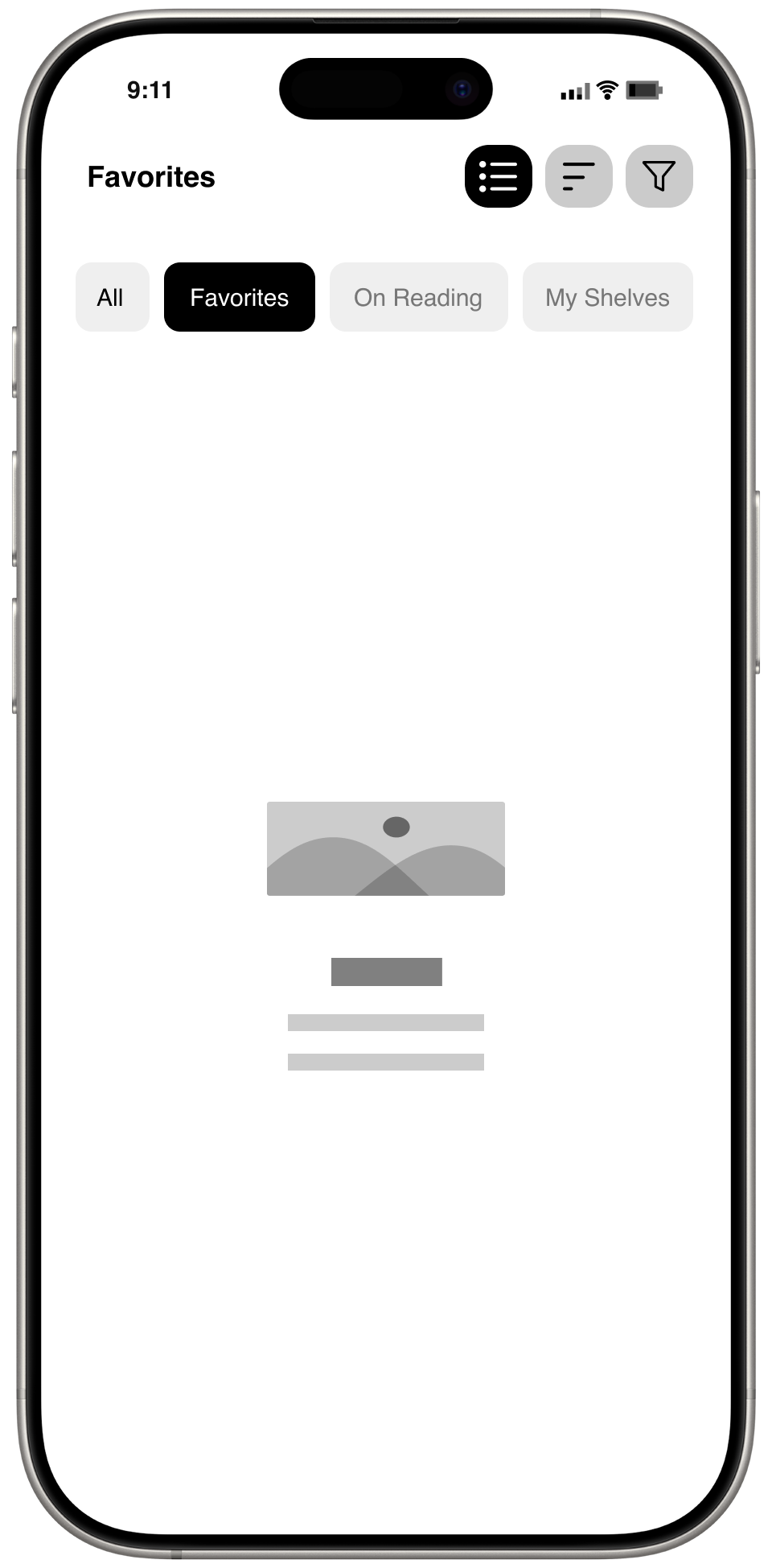
Landing Screen
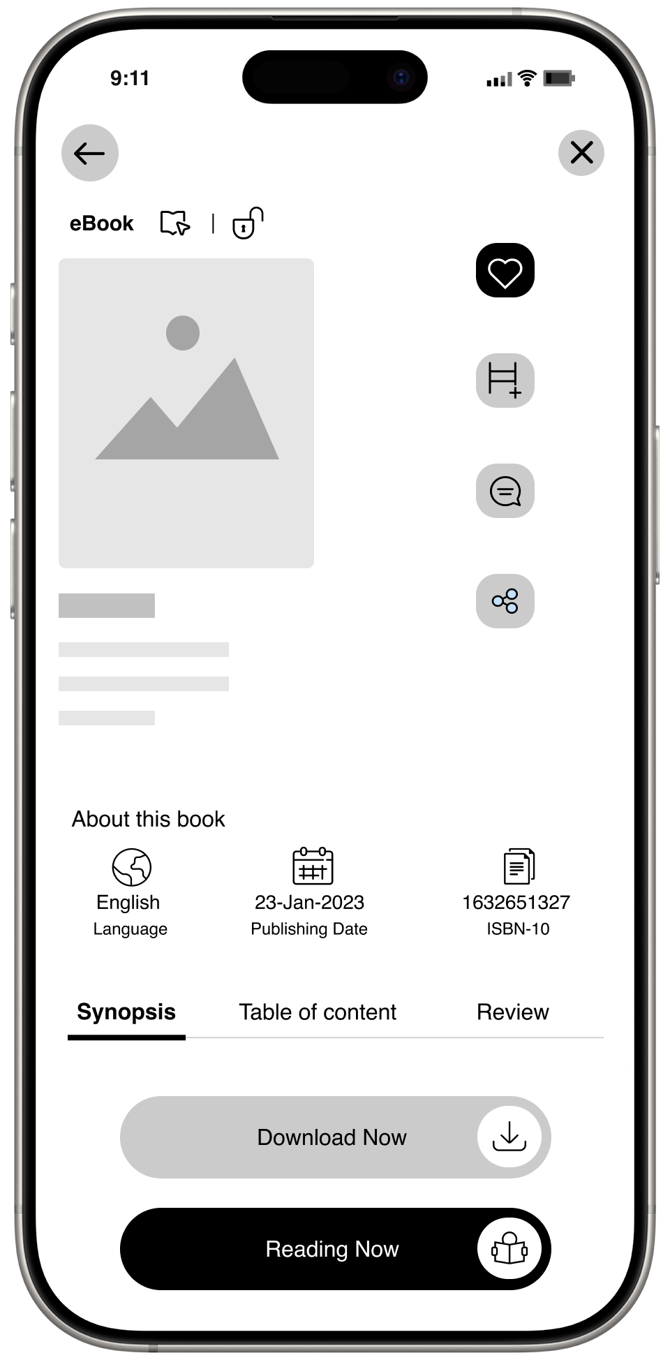
Product Detail Screen
Add to Cart
Check Process
History
Strength
- Easy-to-identify language change.
- Priority given to search bar.
- Displaying promotional banner.
- Two cards with minimal text look good.

- Complete information fits on the screen.
- Clear discussion of the price range.
- High importance given to call to action.
- Video added for user assistance on 'How it works'.
1. Show the number of products added in detail.
2. User can change the subscription method using the dropdown.
1. Gather Complete Information.
N/A
Weakness
1. No main navigation bar at the bottom or top.
2. Products are not visible at a glance and require scrolling.
3. Too much unhelpful content on the screen.

1. No mobile app feeling. Looks like a web page.
2. I can't go back to the previous screen.
3. It's more of feels more like a responsive web page.
4. No similar product recommendations.

1. Unable to remove a product from the cart.
2. Unable to go back to the previous screen.
1. No smooth checkout process. 5-step process
2. Not all Payment methods are available.

1. Unable to track my purchase history.
User interview: Qualitative Interview
I conducted a survey where I asked potential users via a questionnaire about the
challenges they face with book apps. The questions are as follows:
Question
1. What's your age?
2. What's your gender?
3. What do you do for a living?
4. Do you read books or listen to audio books?
5. What type of books do you read?
6. How frequently do you read or listing to a book?
7. Do you prefer reading Online or offline?
8. How often do you purchase a book or Journal?
9. From where would you like to purchase a book or Journal?
10. How would you feel read the books from online?
11. How would you feel about that app, Features and UI?
Common answers
1. 18 to 64
2. Both
3. Students, Professors, Doctors, Nurses, Technicians,
Doctorates, Researchers
4. Depends on book
5. Education, Research, Knowledge, Novels, Self Learning
6. Daily, weekly twice, Monthly 8 Days.
7. Mostly Online, walk the library to read offline.
8. Monthly 1, 2, every 6 months, Read Article every day.
9. Online stores, Apps, Yearly subscription from the publisher.
10. Online books are more easy access and ready to read.
11. Only a few of the Apps have required features, For every
product type need to download different types of apps.
Survey & interview results

Users don't seem to care much about setting goals or personal reading stats.
Users care more about keeping track of books they want to read.
Users are interested in what their friends and family are reading.
New books are primarily discovered by looking at and hearing about them.
Users especially like recommendations from people they trust, even more so from people they know personally.
Users prefer reviews from trusted sources, such as news sites, blogs, or book critics, rather than from random people.
Useful, accurate recommendations are helpful because they filter through the overwhelming number of books available.
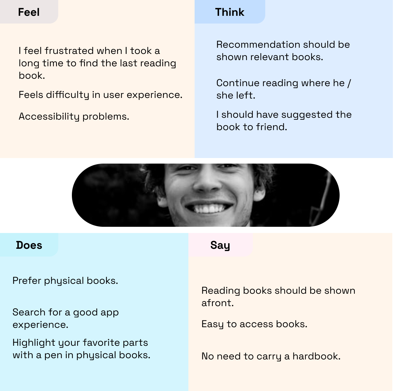
Define Persona


Ohm Gupta
B2B User
Age:
Location:
Occupations: .
Place of work: .
Device:
Most Used App :
35
Bengaluru
Software Engineer
HCL Bengaluru
Samsung, iPhone 13
Instagram, Amazon
About
Ohm Gupta has been a software engineer. Because of his profession, he constantly needs to learn new topics in his domain. Since so many books are available in the market, he finds it difficult to choose the right one. He always asks peers to recommend a book that helps him study a new topic, learn from it, and write research papers.
Pain Point

Does not get a feature to highlight key part while reading.
Does not have time to get hardcover books.
Subscription are expensive.
Inaccurate recommendations are not helpful.
Goals
Track of books easily at in one place.
Clear and more delightful app experience.
Feature to highlight parts of easy access later.
Rightful recommendation will help.
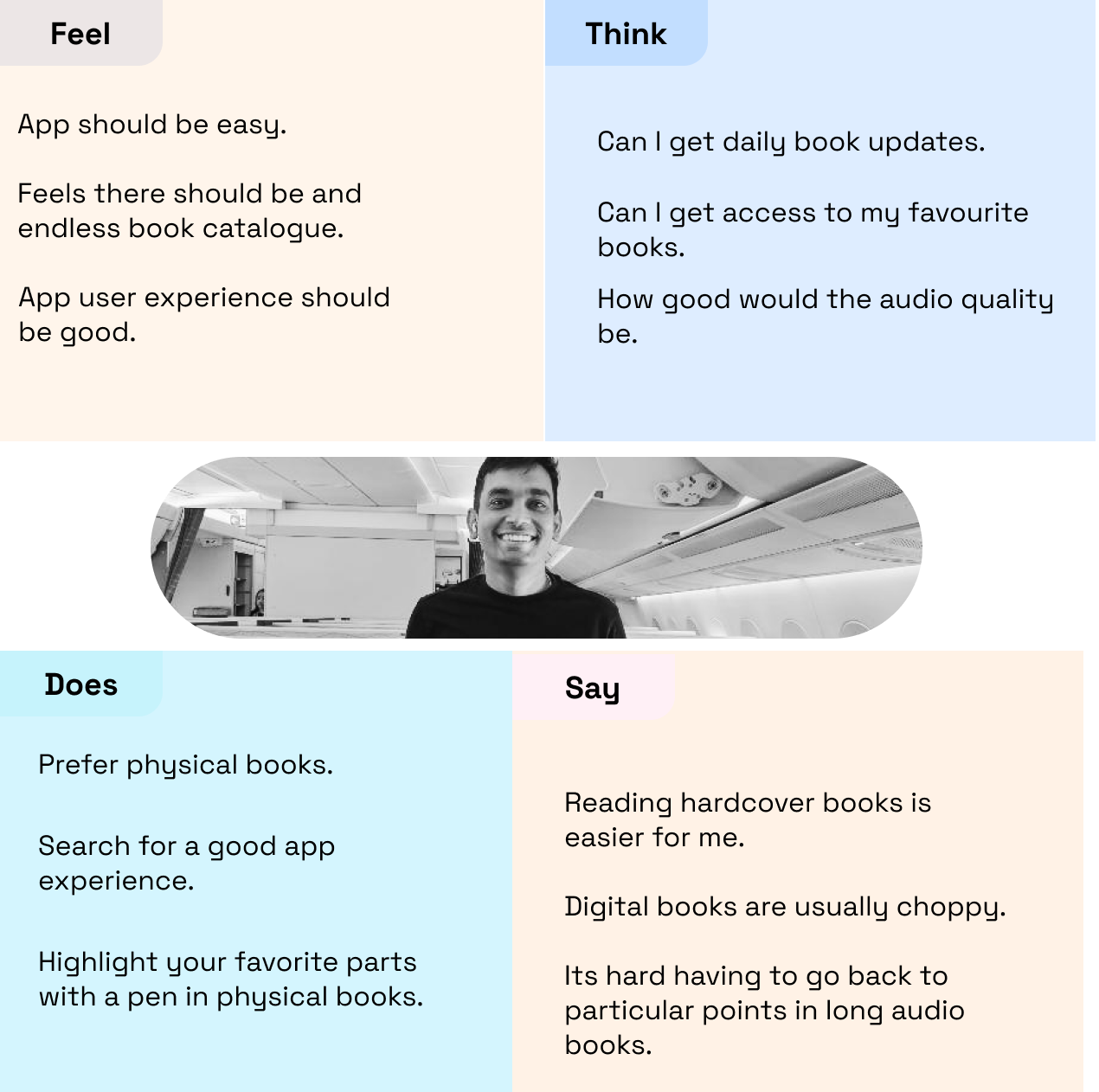
Ayush Agrawal
B2C User
Age:
Location:
Occupations: .
Place of work: .
Device:
Most Used App :
38
Bengaluru
Accountant
Swiggy Bengaluru
Samsung
Instagram, Swiggy, Amazon
About
Ayush Agrawal is an account manager by profession. He constantly explores and studies new topics in his domain. He spends a lot of time reading books and applying his knowledge to his research activities.

Pain Point

Does not get key features to remember or recall on his past readings.
Does not have time to get hardcover books.
Books are so expensive to buy.
Identifying the right books to read.
Goals
Track of books easily at in one place.
Clear and more delightful app experience.
Feature to highlight parts of easy access later.
Rightful recommendation will help.
Empathy Maping
Journey Maping
Scenario:
Most book readers are transformed to digital. Search for the best app with a good user experience and necessary features which gives them a good reading experience and a smooth exit process.
Stages:
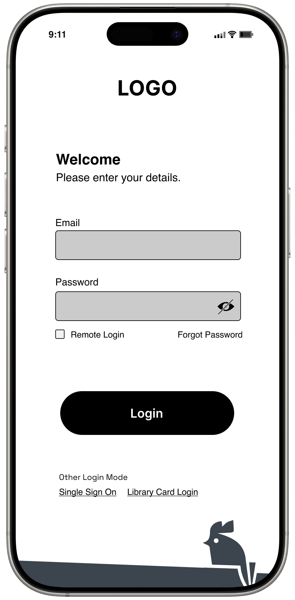
Signup/Signin
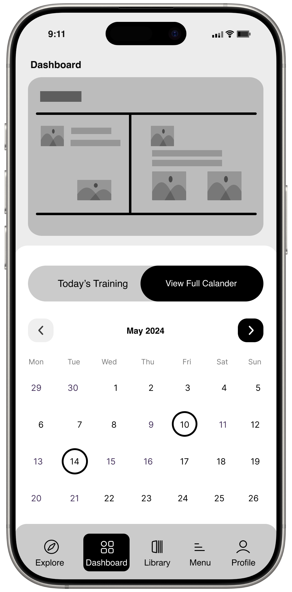
Home
Product Details
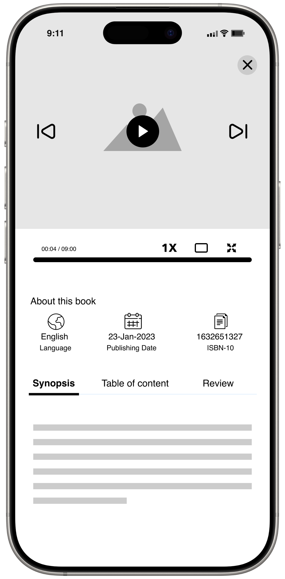
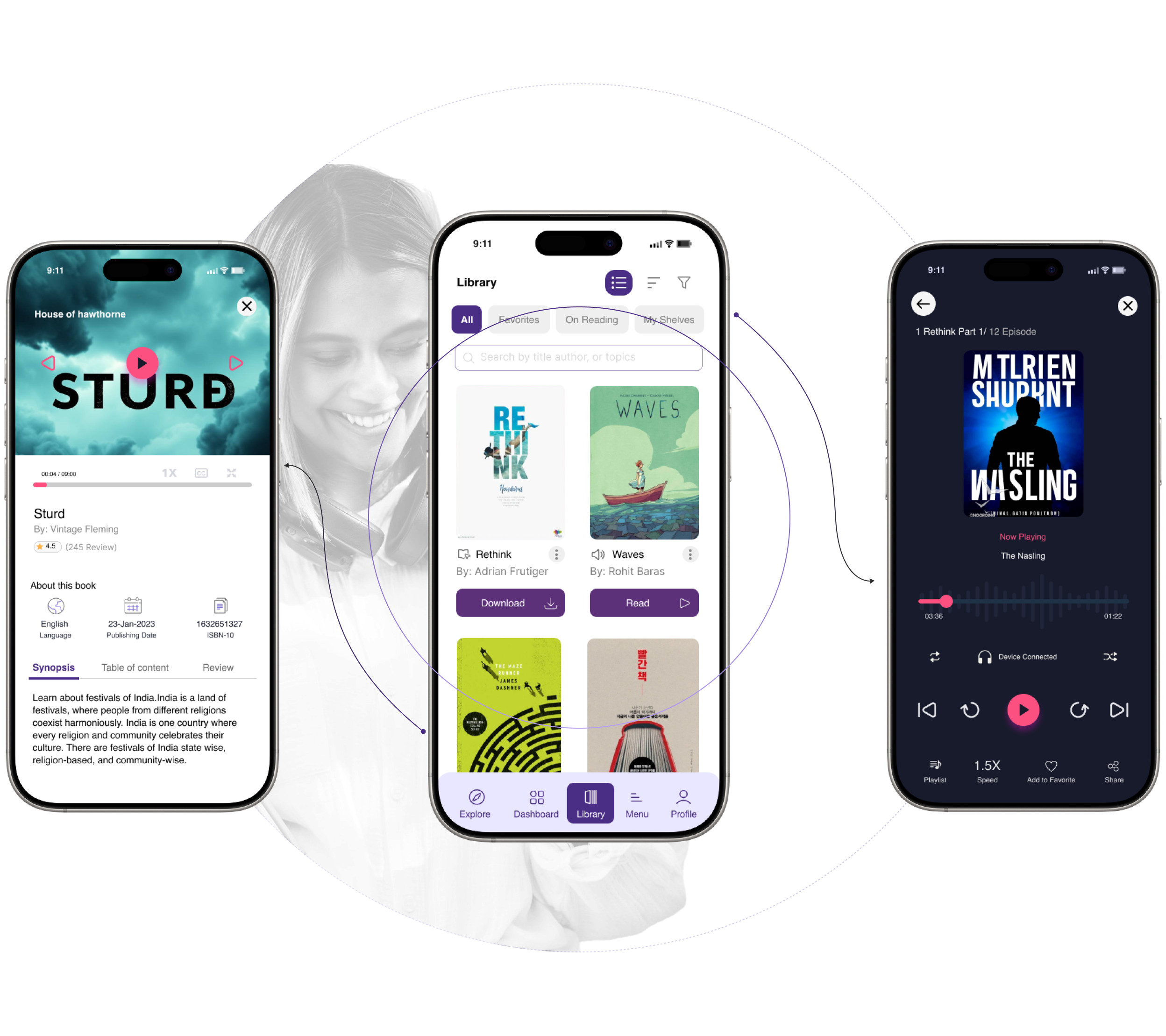
Reading Experience
Doing
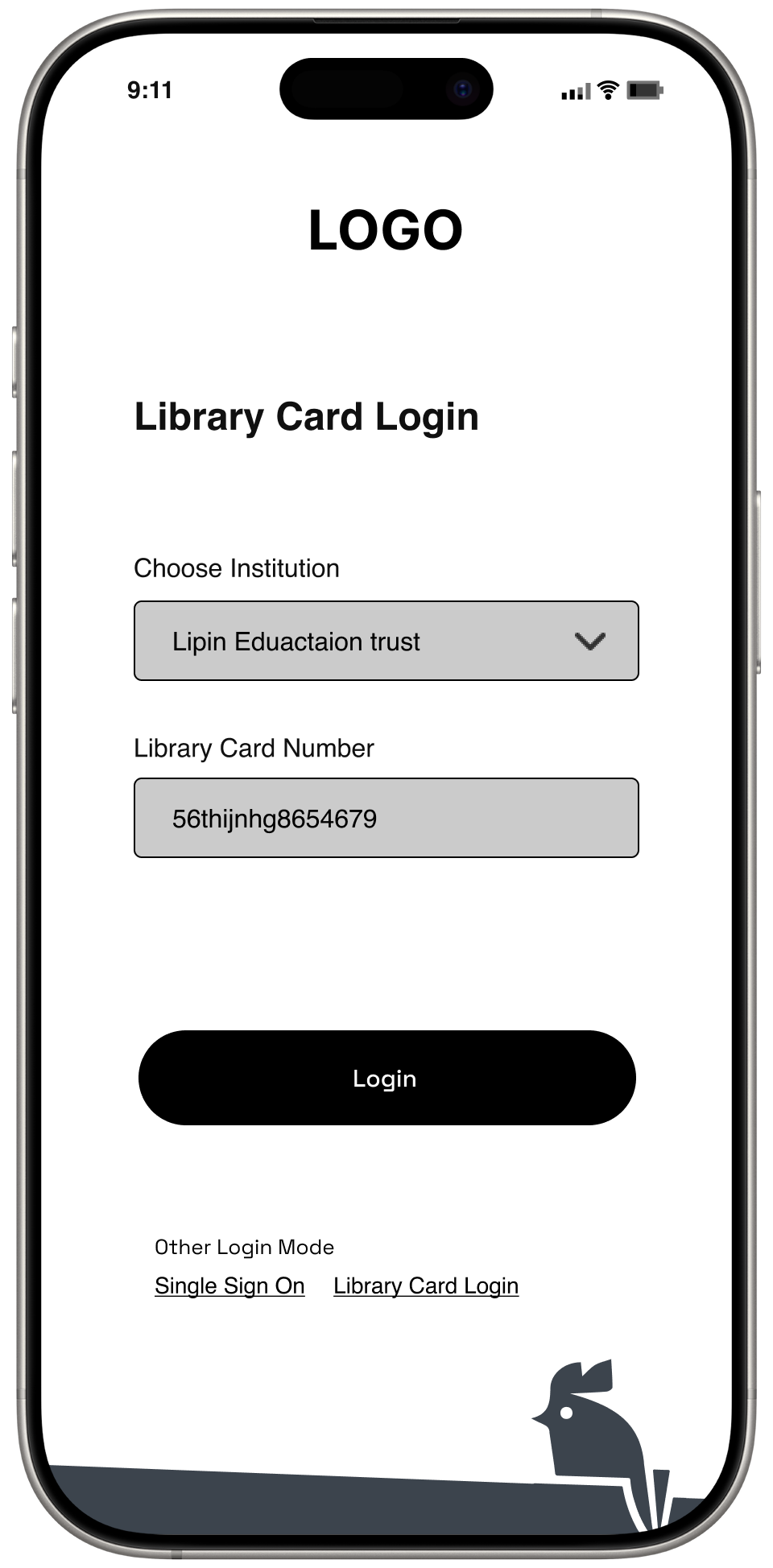
B2b users enter ID provided by institute to sign password to generate.
B2C has to signup with their personal mail account.
B2b Only assigned book is accessible.
B2C has a hues set of book rack where user can choose on choice.
B2b Only assigned books can be download to read.
B2C Use can have a privilege to purchase.
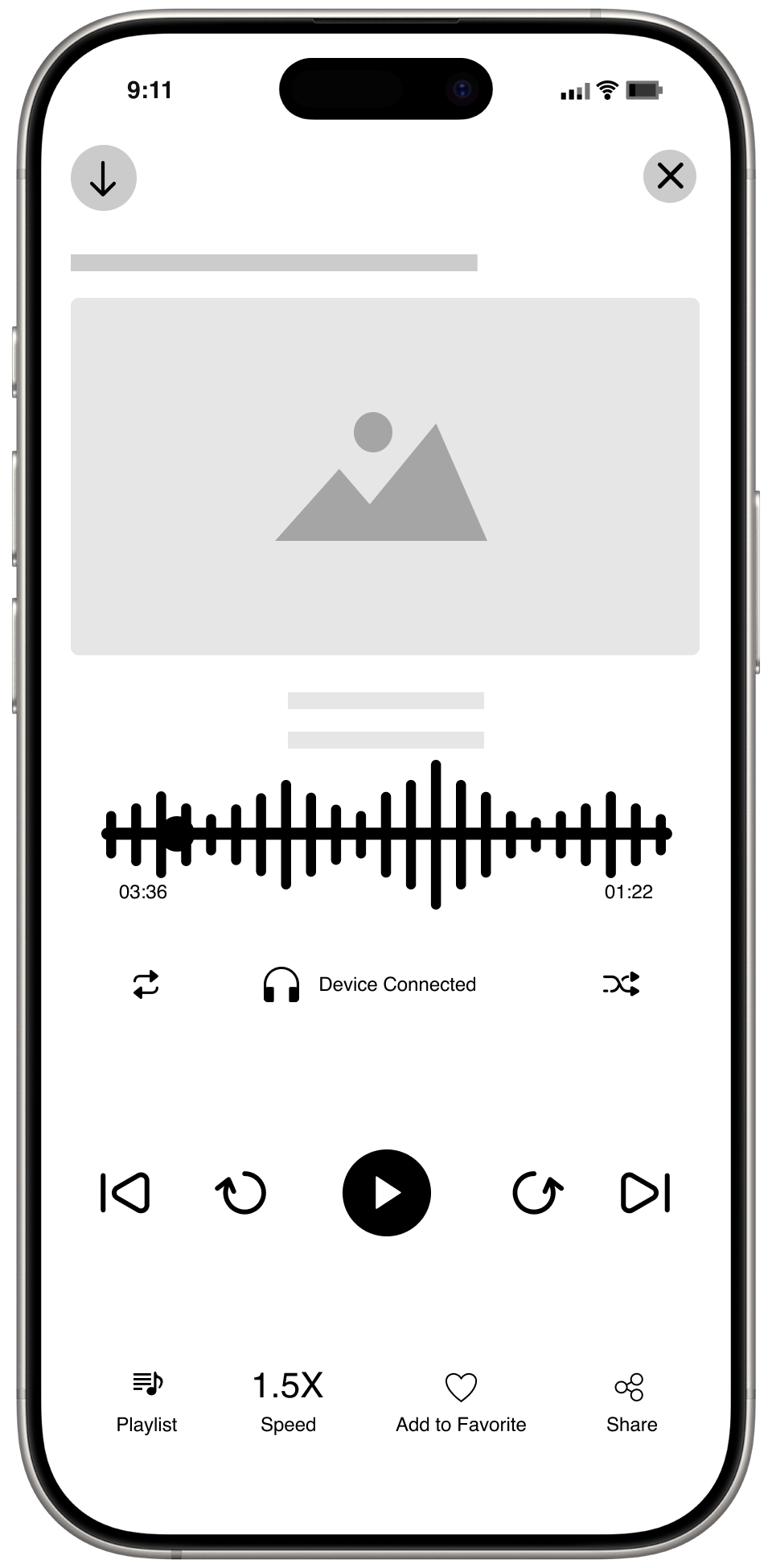
Reader tool will help the both
users to read book.
Touch Points
Bookshelf
Inkitt
Bookshelf
R Discovery
Inkitt
Bookshelf
R Discovery
Inkitt
Bookshelf
R Discovery
Inkitt
Thinking
Easy and smooth process.
Investing more in the signup.
Only shown a limited no. of books.
Identifying required book Should be faster.
Minimal information on the pages.
Should give some access to read the synopsis.
Should tag by readings.
Should have a highlighter.
Feelings
Boring signup process.
Lack of user experience in the screens.
Unable to identify the action.
Accessibility problem.
Poor Branding styles.
Too many feature in the product which is not helpful.
Colour correction feature with in the tool.
Not having Font Type to choose user choice.
Experience


Apportunities
Capture User Interest during
the signup process.
Categories, Filter, Advance Search, Recommendation, Promotional Activities.
Maximum details to be listed in the details page.
Kindle reader inspiration.
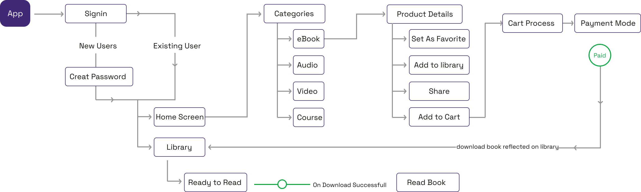
Site Map
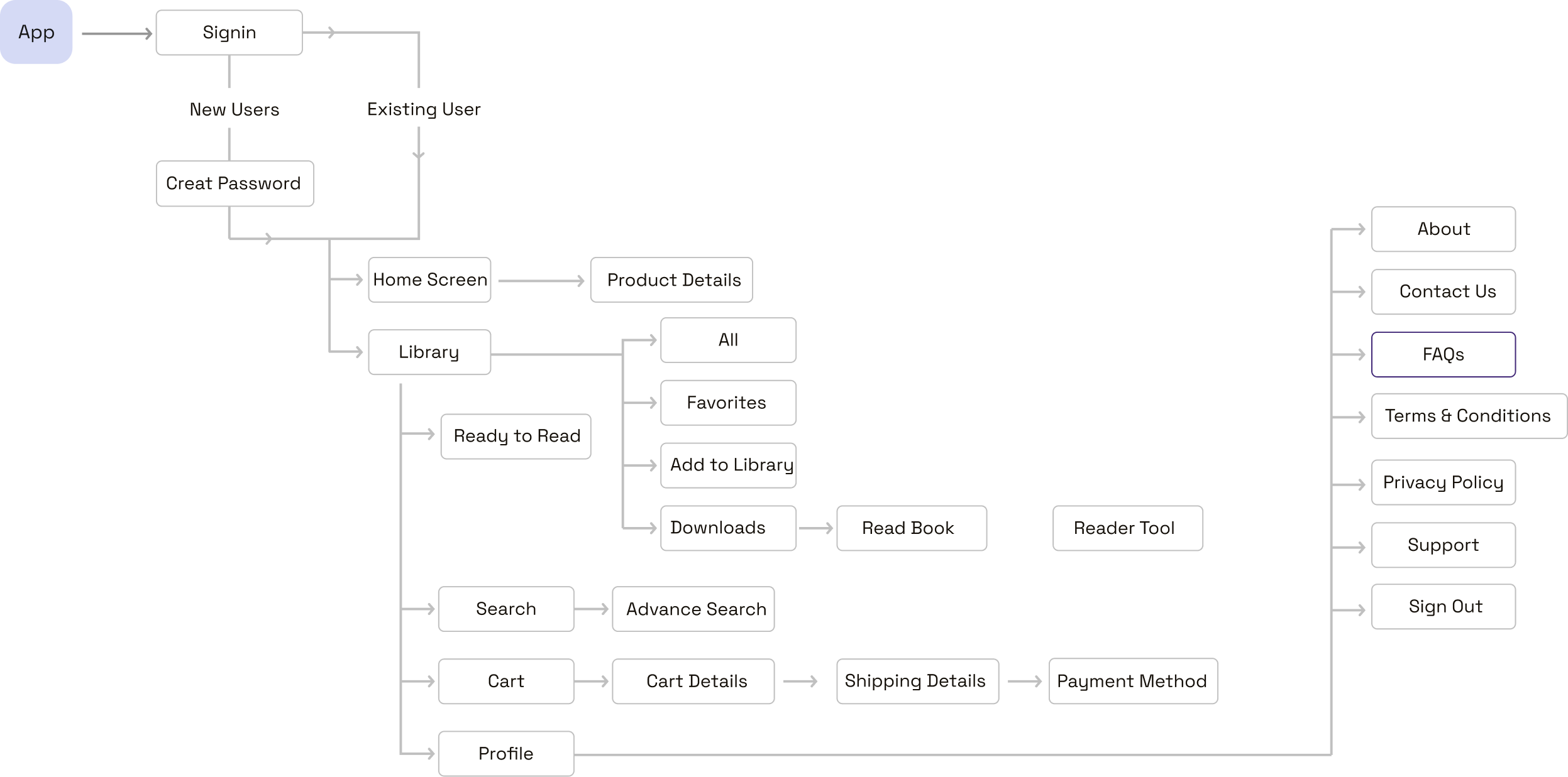
User Flow B2B

User Flow B2C
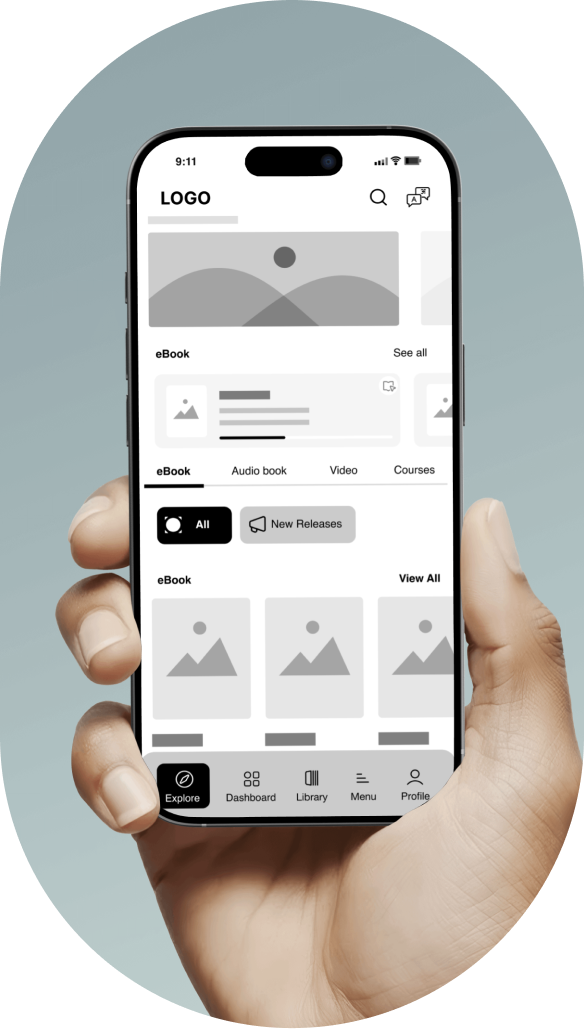
Mid Fidelity

Visual design
It enhances the user experience by aligning aesthetics with functionality, ensuring athletes enjoy a seamless and visually appealing booking process.

Style Overview

ABCDEFGHIJKLMNOPQRSTUVWXYZ
abcdefghijklmnopqrstuvwxyz
1234567

Primary Colors
These three main colors are light lavender or pastel purple, black, and deep shade of purple. Light grey is used mainly for backgrounds, and black is used for headers, body text, icon outlines. Not that black is not pure black its deep grayish-blue. In addition, shades of grey are used in the design. Deep shade of purple used for CTA and icon color.
deep shade of purple
#422978
deep grayish-blue
#3C444D
light lavender or pastel purple
#E9E6FF
pastel lavender-pink
#EACBF7
ultra-light gray
#F6F6F6
Tertiary Color
These colors, formed by blending primary and secondary hues, add depth and sophistication to any design. They help achieve smoother transitions between colors, making visuals more dynamic and engaging.
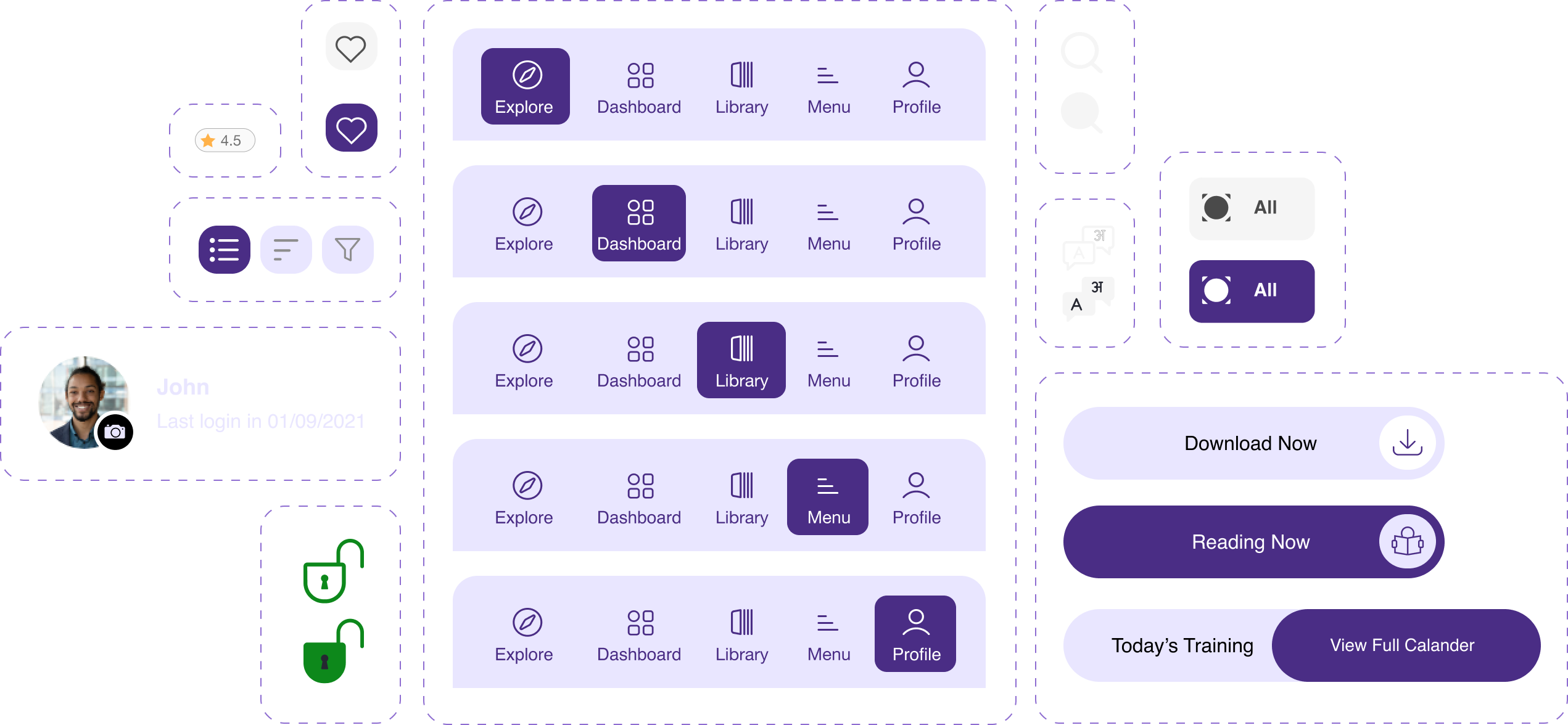
Icons
Informative Icons

Actionable Icons
Placeholder Icons

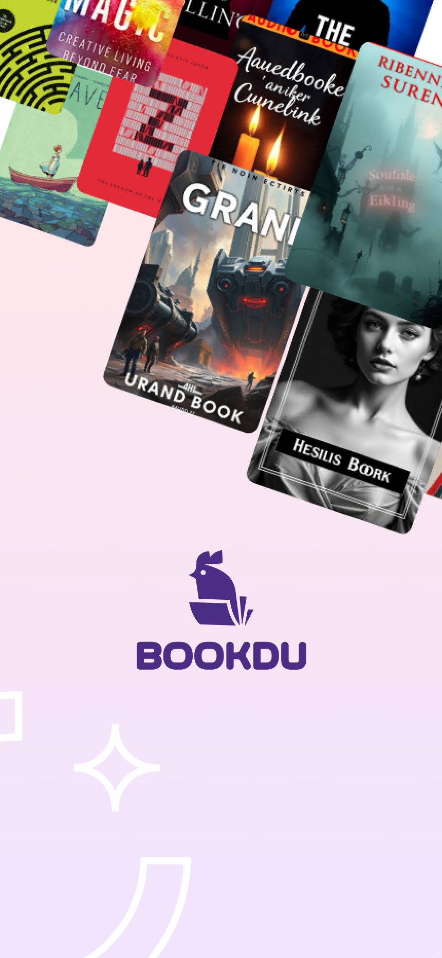
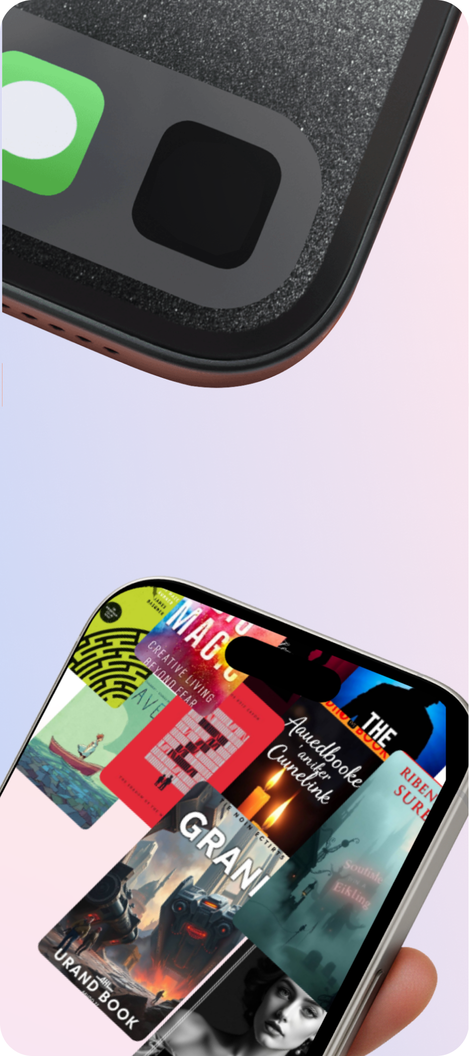
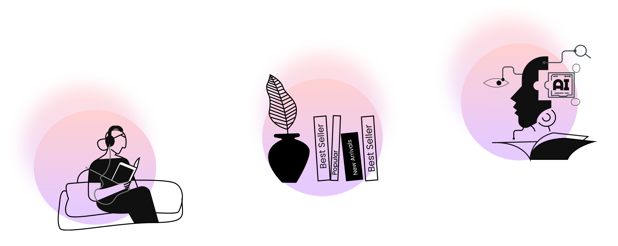
Illustration
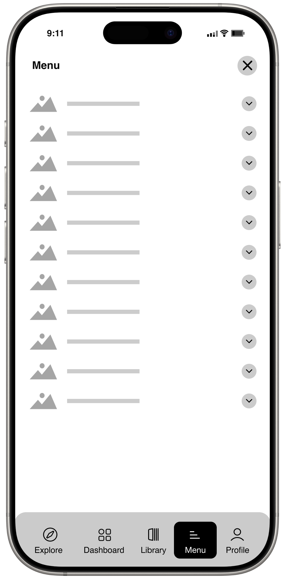
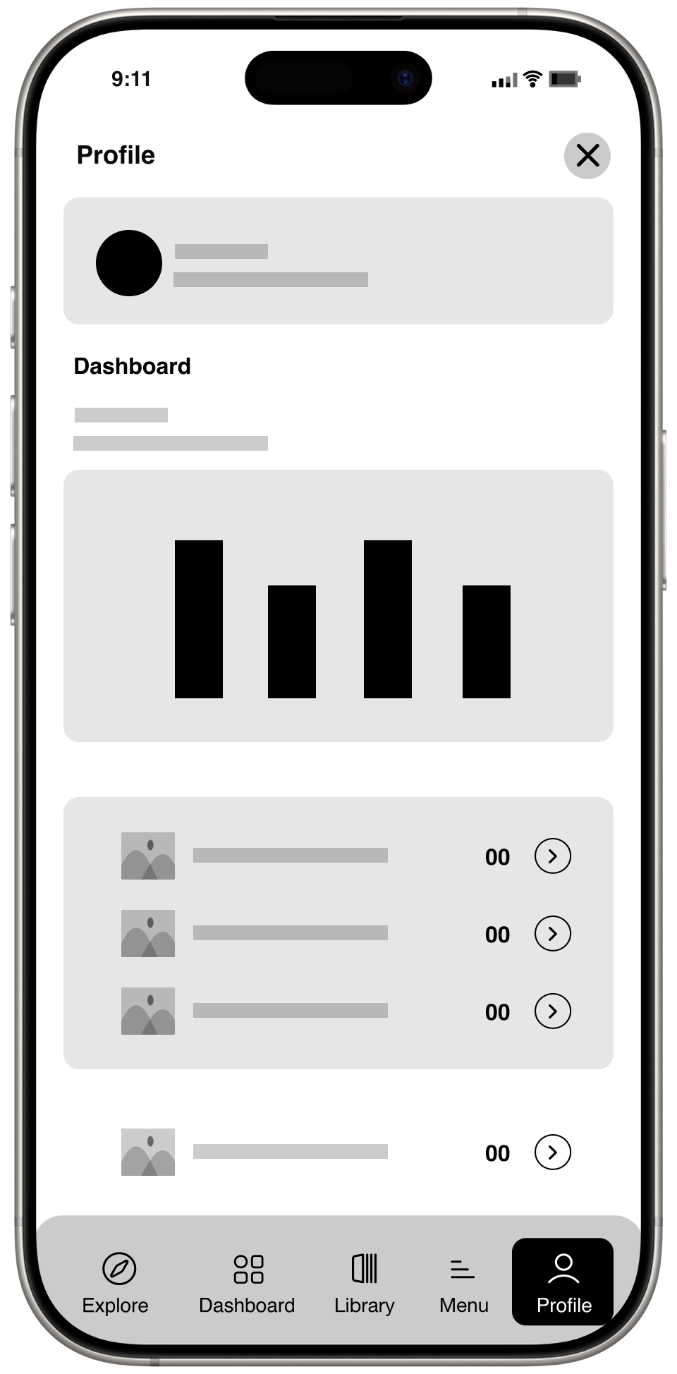
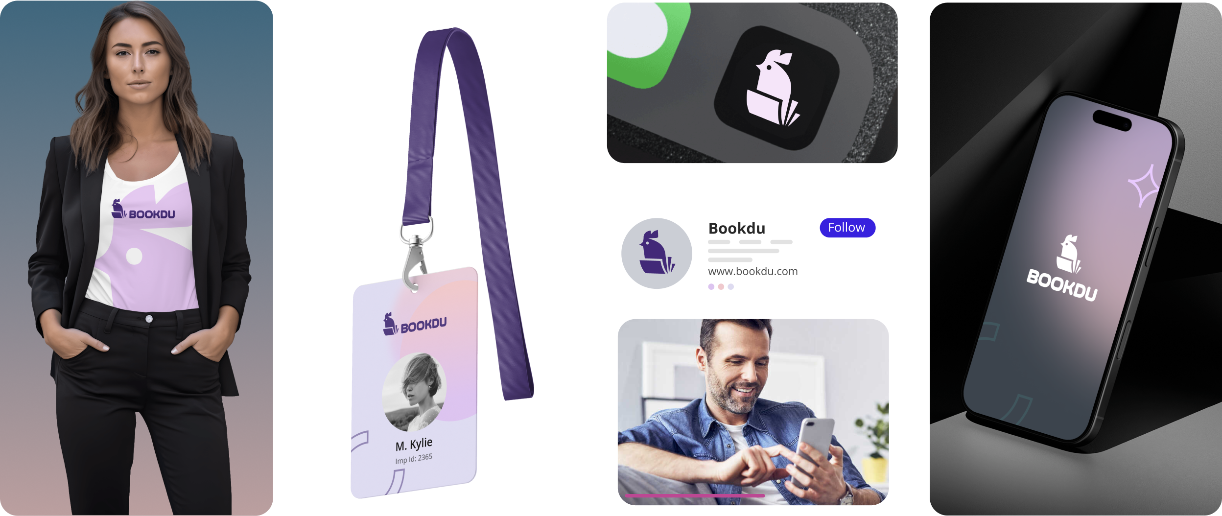
Design System
Brand Identity
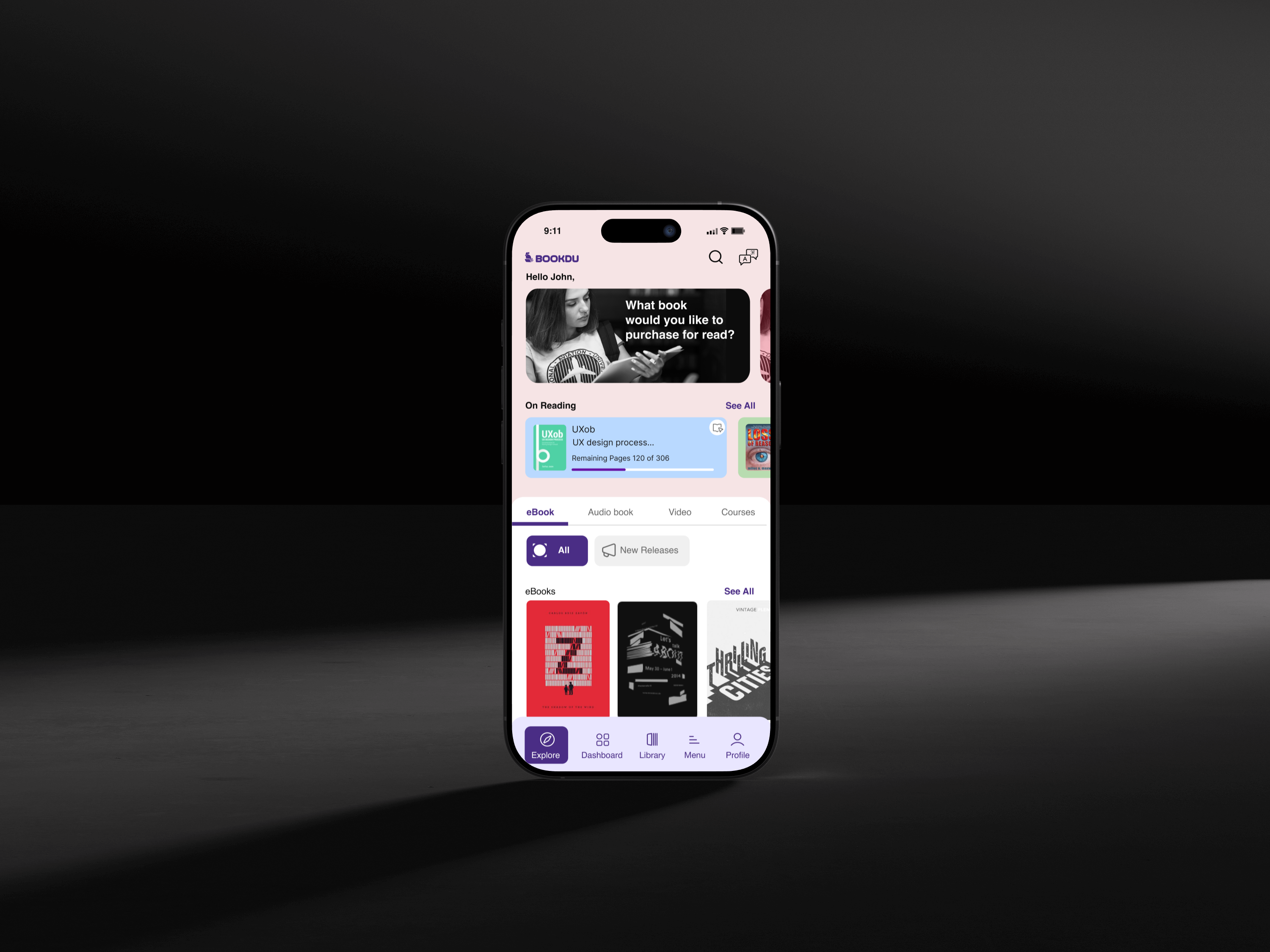
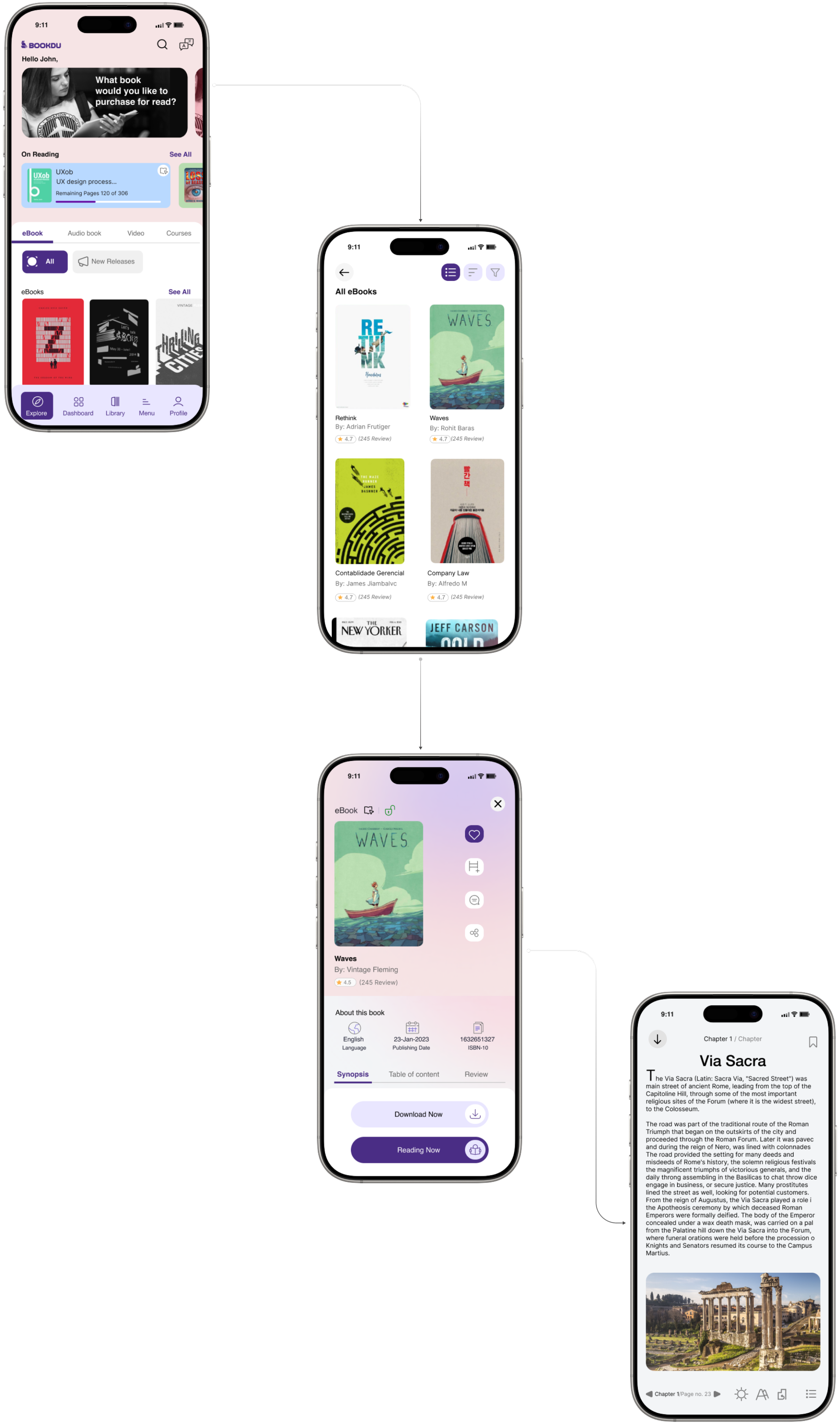
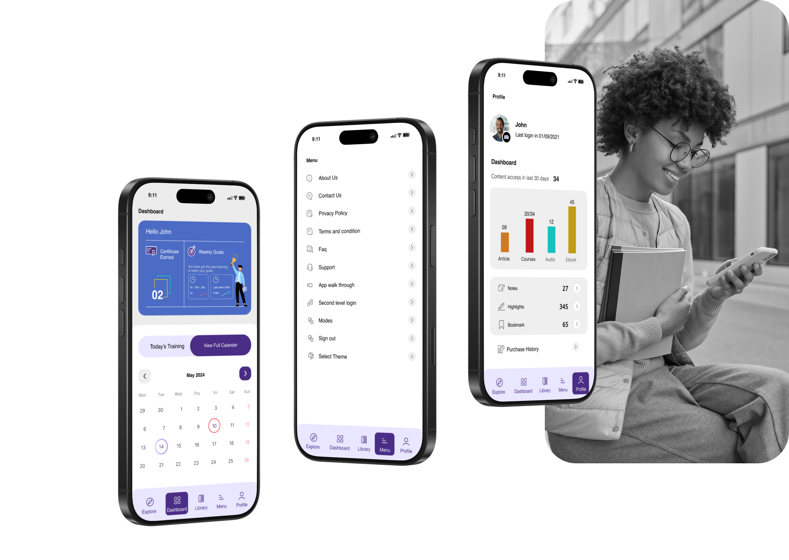
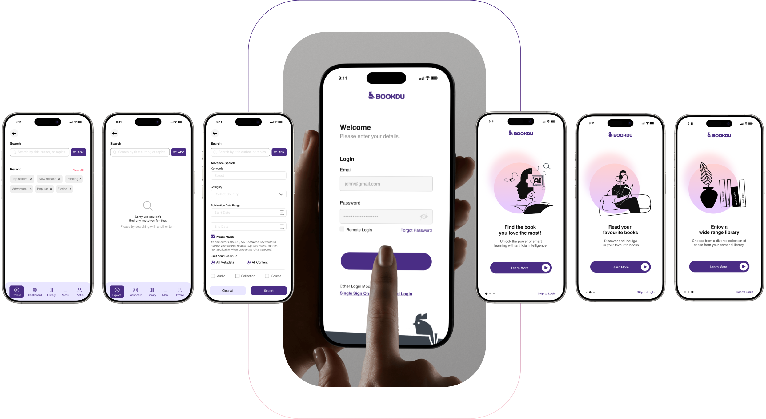
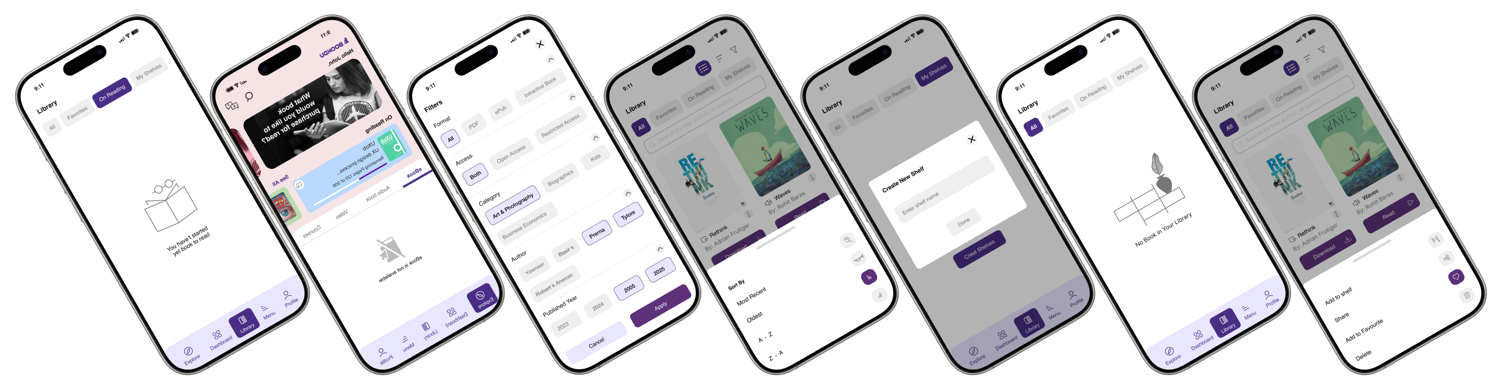
Home Screen


+91 9304898229

cs@csdn.design
Instagrame
Dribbble
Behance
Youtube

© 2026 CSDN Design. All rights reserved.